請輸入想查詢的單字或片語
typeface
US /ˈtaɪpˌfes/
・UK /ˈtaɪpfeɪs/
A1 初級
n.名詞鉛字的字體
影片字幕
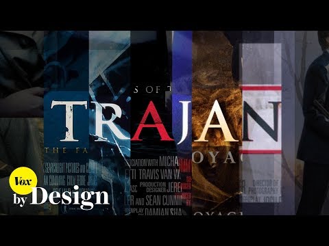
你有發現嗎?電影海報都是這個字體!(How one typeface took over movie posters)
- This typeface — Trajan – is probably one of the most popular movie poster fonts ever.
Trajan 字體大概是電影史上最受歡迎的電影海報字體了。
- In 1989, designer Carol Twombly adapted inscriptions from Roman emperor Trajan's column into a digital typeface.
1989 年,設計師 Carol Twombly 根據羅馬皇帝的圖拉真凱旋柱改寫出數位字體。
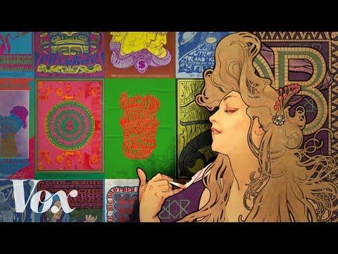
1960年代的「迷幻」風格是怎麼來的?(Where the 1960s "psychedelic" look came from)
- those venues knew that plain typeface and a grayscale photo just wasn't going to cut it.
這些場館知道,普通的字體和灰度的照片是不會成功的,
- In the 60s, artists adapted the bold, dynamic typeface and pushed it even further—softening its lines and obscuring its edges, making it nearly illegible.
在60年代,藝術家調整這種大膽、動感的字體,並將其進一步推陳出新—軟化線條,讓邊緣不分明,使其幾乎難以辨認。
皮克斯動畫:HOPPERS | 獨家短片 + "Hoppers" 差點關於什麼?! (The Pixar Show: HOPPERS | Exclusive Short Film + "Hoppers" was almost about WHAT?!)
- Do you know the name of the Pixar typeface?
你知道 Pixar 的字體叫什麼名字嗎?
什麼!梗圖的字體都是同一款? (The reason every meme uses that one font)
- Every meme is in the same typeface. It's called Impact. But how did that happen?
每張梗圖都有同樣的字體。稱作 Impact。那是如何誕生的呢?
- Impact was later sold to Monotype, another typeface company
Impact 隨後被賣給另一家造字廠 Monotype
創意總監不拘一格的公寓內景 | The Stuff That Surrounds | Wallpaper* (Inside a creative director's eclectic apartment | The Stuff That Surrounds | Wallpaper*)
- It's really about communication and how something sits and sings on a page, how a reader might look at it, how the typography make the word more specific, how even the word with the exact chosen typeface changes the whole meaning of it.
它其實是關於溝通,以及某樣東西在頁面上如何呈現和發聲,讀者可能會如何看待它,字體排印學如何讓文字更具體,甚至連選定的字體如何改變整個意義。
