
abstract
US /ˈæbˌstrækt/
UK /'æbstrækt/
- n. (c./u.)節錄摘要;抽象;(文章的)摘要;抽象藝術
- adj.抽象的;抽象藝術的
- v.t.正在抽象化;寫摘要;正在抽象化
B1 中級中級英檢更多adapt
US /əˈdæpt/
UK /ə'dæpt/
- v.t.改變...的功能;為(新目的)做出改變
- v.i.適應
B1 中級多益中級英檢更多admire
US /ædˈmaɪr/
UK /əd'maɪə(r)/
- v.t.欽佩
A2 初級初級英檢更多aesthetic
US /ɛsˈθɛtɪk/
UK /i:sˈθetɪk/
- adj.美學的;風格的;美學觀點的
- n.美學;美學標準;審美觀;美學;審美觀
B2 中高級高級英檢更多architecture
US /ˈɑrkɪˌtɛktʃɚ/
UK /ˈɑ:kɪtektʃə(r)/
- n. (u.)建築學;建築風格;架構;架構
A2 初級中級英檢更多archive
US /ˈɑrˌkaɪv/
UK /'ɑ:kaɪv/
- v.t.檔案 ; 檔案室 ; 歷史性文件
- n. (c./u.)檔案
B1 中級高級英檢更多as long as
US /æz lɔŋ æz/
UK /æz lɔŋ æz/
- conj.只要;只要;如果;只要
- prep.如果;和...一樣長
- adv.和...一樣長;和...一樣長
A1 初級更多at least
US /æt list/
UK /æt li:st/
- adv.至少;起碼;起碼
- phr.至少;起碼
C2 高級更多back then
US
UK
- phr.當時
A1 初級更多barely
US /ˈbɛrli/
UK /ˈbɛəli/
- adv.勉勉強強地
A2 初級多益中級英檢更多blunt
US /blʌnt/
UK /blʌnt/
- adj.鈍的;直率的
- v.t.使遲鈍
B1 中級高級英檢更多bold
US /bold/
UK /bəʊld/
- adj.大膽;醒目的;粗體的
- n.清楚;顯眼
B1 中級中級英檢更多capture
US /ˈkæptʃɚ/
UK /'kæptʃə(r)/
- v.t.引起注意;記錄;拍攝;補獲;佔領;奪得;捕捉;描繪;(西洋棋)吃掉
- n.捕獲;佔領
B1 中級中級英檢更多color palette
US
UK
- n.調色盤;配色方案
A1 初級更多conflict
US /ˈkɑnˌflɪkt/
UK /'kɒnflɪkt/
- n. (c./u.)衝突;爭執;戰爭;內心衝突
- v.t./i.衝突;抵觸
A2 初級初級英檢更多contrast
US /ˈkɑ:ntræst/
UK /'kɒntrɑ:st/
- v.t./i.對比;相比之下
- n. (c./u.)對比;(光線)對比
- v.i.形成對比;形成對比
A2 初級中級英檢更多curly
US /ˈkə:li/
UK /'kɜ:lɪ/
- adj.捲縮的;彎曲的
B2 中高級更多dial
US /ˈdaɪəl/
UK /'daɪəl/
- v.t.撥號
- n. (c./u.)號碼盤 ; 電話號碼盤 ; 撥號盤;調節器
B1 中級多益初級英檢更多dial up
US
UK
- phr.撥號
- v.t./i.撥號
B1 中級更多dynamic
US /daiˈnæmik/
UK /daɪˈnæmɪk/
- adj.有活力的;精力充沛的
B1 中級多益中級英檢更多edge
US /ɛdʒ/
UK /edʒ/
- n. (c./u.)優勢;刀緣;邊緣;邊沿
- v.t.使鋒利;邊
- v.t./i.邊緣 ; 邊飾
A2 初級多益初級英檢更多establish
US /ɪˈstæblɪʃ/
UK /ɪˈstæblɪʃ/
- v.t.確立 ; 設立;建立;安頓
A2 初級多益中級英檢更多feature
US /ˈfitʃɚ/
UK /'fi:tʃə(r)/
- n. (c./u.)特別報導;專欄;特徵;特點;面部特徵;電影長片
- v.t.由...主演;以...為特色
- adj.主要的;重要的
A2 初級多益中級英檢更多feminine
US /ˈfɛmənɪn/
UK /ˈfemənɪn/
- adj.女性特有的;女性的;陰性的;女性荷爾蒙的
- n.女性;女性特質;陰性詞尾
B2 中高級高級英檢更多figure out
US /ˈfɪɡjɚ aʊt/
UK /ˈfiɡə aut/
- phr. v.理解;解決;解決;想出;計算出
- v.t./i.理解;理解;解決;發現;查明;計算
- phr.v.弄清楚,理解
A1 初級更多floral
US /ˈflɔrəl, ˈflor-/
UK /'flɔ:rəl/
- adj.花的
B2 中高級更多fluid
US /ˈfluɪd/
UK /'flu:ɪd/
- n. (c./u.)流體;液體;液體(水);體液
- adj.不固定的;不穩定的;流動的
B2 中高級高級英檢更多font
US /fɑnt/
UK /fɔnt/
- n.字體;字形
B2 中高級更多formula
US /ˈfɔrmjələ/
UK /'fɔ:mjələ/
- n. (c./u.)式;準則;化學式;配方奶;配方
A2 初級多益中級英檢更多glance
US /glæns/
UK /glɑ:ns/
- n.瞥
- v.i.瞥向
A2 初級中級英檢更多go hand in hand
US /goʊ hænd ɪn hænd/
UK /gəu ˈhænd ɪn ˈhænd/
- idm.密切相關
B1 中級更多hippie
US /ˈhɪpi/
UK /ˈhɪpi/
- n.嬉皮士
B2 中高級更多in hand
US /ɪn hænd/
UK /in hænd/
- phr.在手邊
in part
US /ɪn pɑrt/
UK /in pɑ:t/
- adv.部分地
A1 初級更多instead of
US /ɪnˈstɛd ʌv/
UK /inˈsted ɔv/
- prep.代替
- adv.寧願
A1 初級更多launch
US /lɔntʃ, lɑntʃ/
UK /lɔ:ntʃ/
- n.發布;發行;發射;汽艇
- v.t.發行(新商品);使起飛;發射;使(新船)下水
A2 初級多益中級英檢更多legend
US /ˈlɛdʒənd/
UK /'ledʒənd/
- n.(地圖上的)圖例;傳奇;傳說;銘文
B1 中級中級英檢更多look at
US /lʊk æt/
UK /luk æt/
- phr. v.查看;看著;看著;檢查
A1 初級更多much about
US /mʌtʃ əˈbaʊt/
UK /mʌtʃ əˈbaut/
- phr.關於很多;非常關心
A1 初級更多mundane
US /mʌnˈden, ˈmʌnˌden/
UK /mʌnˈdeɪn/
- adj.庸俗的;世俗;世俗的;塵世的
B2 中高級多益更多nouveau
US
UK
- adj.新近到達的;新近產生的
B2 中高級更多of course
US /ʌv kɔː(r)s/
UK /ɔv kɔː(r)s/
- adv.當然
- phr.確信的
- interj.當然
A2 初級更多on acid
US /ɑn ˈæsɪd/
UK /ɒn ˈæsid/
- adv. phr.服用迷幻藥狀態下
C1 高級更多opt
US /ɑ:pt/
UK /ɒpt/
- v.i.選擇
B1 中級高級英檢更多out there
US /aʊt ðɛr/
UK /aut ðɛə/
- adv.在那裡;存在於宇宙中;在世界上(尤指危險或困難時)
- adj.非傳統的;奇怪的;前衛的;存在的
A1 初級更多outside of
US /aʊtˈsaɪd ʌv/
UK /ˌautˈsaid ɔv/
- prep.在...之外;在...範圍之外;除了...
A1 初級更多palette
US /ˈpælɪt/
UK /ˈpælət/
- n. (c.)調色板 ; 裝甲板
B1 中級更多psychedelic
US /ˌsaɪkɪˈdɛlɪk/
UK /ˌsaɪkəˈdelɪk/
- adj.迷幻藥;迷幻的;迷幻藝術的
C2 高級更多radically
US /ˈrædɪkl:ɪ/
UK /'rædɪklɪ/
- adv.激進地
B1 中級更多reference
US /ˈrɛfərəns, ˈrɛfrəns/
UK /'refrəns/
- n.推薦函;參考文獻;參考文獻;參考;提及;參考資料;查閱;引用 (電腦科學);證明人;提交仲裁;參考點;參考書
- v.t.參考;參考
- prep.關於
A2 初級多益中級英檢更多reflect
US /rɪˈflɛkt/
UK /rɪ'flekt/
- v.t./i.反映出...;顯示出...;反射;反射;照出;反思
A2 初級多益中級英檢更多represent
US /ˌrɛprɪˈzɛnt/
UK /ˌreprɪ'zent/
- v.t.具象派的;象徵;表示;代表(政府機關);當...代表
A2 初級多益中級英檢更多reproduce
US /ˌriprəˈdus, -ˈdjus/
UK /ˌri:prə'dju:s/
- v.t./i.再生:複製;複製
B1 中級高級英檢更多resurgence
US /rɪˈsɜ:rdʒəns/
UK /rɪˈsɜ:dʒəns/
- n. (u.)再起 ; 復活 ; 再現
B2 中高級更多revolution
US /ˌrɛvəˈluʃən/
UK /ˌrevə'lu:ʃn/
- n.革命;大變革;迴轉
B1 中級中級英檢更多spread
US /sprɛd/
UK /spred/
- n. (c./u.)盛宴;差異;差距;塗食品的果醬(或奶油);傳播;盛宴
- v.t./i.蔓延;擴散;散布;傳播;張開;展開
- v.t.塗(果醬等)
- v.i.蔓延;流行;傳播;普及
A2 初級多益初級英檢更多synonymous
US /sɪˈnɑnəməs/
UK /sɪˈnɒnɪməs/
- adj.同義字的
B2 中高級高級英檢更多utility
US /juˈtɪləti/
UK /ju:ˈtɪləti/
- n. (c./u.)(電、煤氣、鐵路等)公共設施;實用工具;多用途工具;實用程式;多功能車
- n. (u.)效用;實用;效用
- adj.實用的;多用途的
B1 中級高級英檢更多vibrate
US /ˈvaɪˌbret/
UK /vaɪˈbreɪt/
- v.i.搖動;振動
B2 中高級高級英檢更多
Vocabulary
- of course: 當然
- in hand: 在手邊
- go hand in hand: 密切相關
- much about: 關於很多
- back then: 當時
- outside of: 在...之外
- out there: 在那裡
- dial up: 撥號
- look at: 查看
- color palette: 調色盤
- instead of: 代替
- figure out: 理解
- as long as: 只要
- at least: 至少
- on acid: 服用迷幻藥狀態下
- in part: 部分地
- conflict: 衝突
- barely: 勉勉強強地
- aesthetic: 美學的
- bold: 大膽
- dynamic: 有活力的;精力充沛的
- represent: 具象派的
- spread: 盛宴
- abstract: 節錄摘要
- feature: 特別報導;專欄
- reflect: 反映出...;顯示出...
- fluid: 流體;液體
- admire: 欽佩
- establish: 確立 ; 設立
- reference: 推薦函
- mundane: 庸俗的
- contrast: 對比;相比之下
- adapt: 改變...的功能
- edge: 優勢
- formula: 式
- plain: 川
- architecture: 建築學
- launch: 發布;發行
- glance: 瞥
- synonymous: 同義字的
- capture: 引起注意
- radically: 激進地
- blunt: 鈍的
- revolution: 革命
- utility: (電、煤氣、鐵路等)公共設施
- opt: 選擇
- detail: 細節;瑣事
- legend: (地圖上的)圖例
- feminine: 女性特有的
- archive: 檔案 ; 檔案室 ; 歷史性文件
- pull: (吸)一口(菸)
- change: 換(衣服)
- dial: 撥號
- epicenter: 震央
- palette: 調色板 ; 裝甲板
- reproduce: 再生:複製
- concert: 合奏 ; 演奏會 ; 音樂會
- wind: 風
- start: 開端
- world: 世界;地球
- floral: 花的
- font: 字體;字形
- resurgence: 再起 ; 復活 ; 再現
- vibrate: 搖動;振動
- people: 人
- hand: 一手牌
- psychedelic: 迷幻藥
- letter: 個字符
- look: 表達(如眼睛),外觀
- vietnam: 越南
- beautiful: 出色的
- curly: 捲縮的;彎曲的
- hippie: 嬉皮士
- nouveau: 新近到達的;新近產生的
在 App 中使用完整體驗
隨時隨地學習,完整解析句子與用法
01:03
She took a brave step forward, leaving behind her comfort zone to chase her dreams.
單字片語
- brave
adj. 有勇氣的
- comfort zone
phr. 舒適圈
本句說明
a brave step 是名詞片語,其中 brave 是形容詞,修飾名詞 step,表示「勇敢的一步」。
forward 是副詞,修飾 step,表示「向前」。
整個片語作為受詞,回答 took(動詞) 的「什麼」——她邁出了勇敢的一步向前。
在 App 中使用完整體驗
隨時隨地查單字,掌握發音、詞性與用法
brave
US/brev/
UK/breɪv/
adj.勇敢的
v.t.勇敢地面對
A2 初級
在 App 中使用完整體驗
隨時隨地練習口說,立即獲得發音回饋
Try this speaking exercise.
試著跟著這句話練習。
80
0
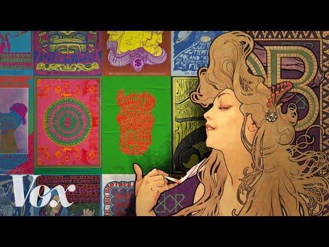
林宜悉 發佈於 2023 年 07 月 23 日想知道 60 年代迷幻(psychedelic)風格的視覺效果是怎麼來的嗎?這支影片將帶你一探超現實主義海報藝術家 Alphonse Mucha 與舊金山 60 年代經典海報之間的驚人連結,解析高對比色彩和獨特字體如何融合。觀看時,你也能學到一些超酷的進階詞彙,深入了解這段迷人的藝術史喔!
在 APP 上學習此影片!
在 VoiceTube App 中有針對影片更深入的練習方式唷!