sans-serif
US
・UK
A1 初級
n.名詞無襯線字體
Serif and sans-serif have no meaning to them, let alone when it's best to use one over the other.
otherpos-map.undefined無襯線字體
However, most content on sites can be sorted into the family areas of serif, or sans-serif, with either having a decent fit into the scheme of the design.
影片字幕
【英語スピーチ】Apple 創業者スティーブ・ジョブズのスタンフォード大卒業式スピーチ|日英字幕 (【英語スピーチ】Apple創業者スティーブ・ジョブズのスタンフォード大卒業式スピーチ|日英字幕)
13:34
- I learned about serif and sans-serif typefaces, about varying the amount of space between different letter combinations, about what makes great typography great.
我瞭解了有襯線和無襯線字體,瞭解了不同字母組合之間的空隙變化,瞭解了優秀的字體設計之所以優秀的原因。
初級平面設計。字體設計 (Beginning Graphic Design: Typography)
06:24
- Sans serif fonts don't have that extra stroke—hence the name, which is French for "without serif."
無襯線字體沒有多餘的筆畫——因此這個名稱在法文中指的是沒有襯線。(Sans 意即沒有)
- like sans serif with serif... short with tall... or decorative with simple.
像是無襯線字體配襯線字體⋯⋯短的配長的⋯⋯或是裝飾性字體配簡潔字體。
OpenAI DevDay 2025:Sam Altman 的開幕主題演講 (OpenAI DevDay 2025: Opening Keynote with Sam Altman)
52:39
- Maybe I prefer sans serif fonts.
也許我偏好無襯線字體。
史蒂夫-喬布斯在斯坦福大學的畢業典禮上的演講
14:46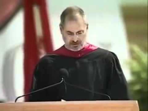
- a calligraphy class to learn how to do this. I learned about serif and sans-serif typefaces,
書法班學習如何做到這一點。我學習了襯線字體和無襯線字體。
字體設計的歷史 - 動畫短片 (The History of Typography - Animated Short)
05:10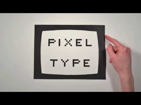
- so he decided to remove them entirely, and made a new kind of typeface, called the Sans Serif.
所以他決定拿掉所有襯線,發明了一種新字體:「無襯線體」
"每當我身處谷底,我就會聽這段講話"【喬布斯在斯坦福大學畢業典禮上的演講】中英大字幕/英語長句快語速 史蒂夫-喬布斯的斯坦福演講 ("每当我身处低谷,我就会听这段讲话”【乔布斯在斯坦福大学毕业典礼上的演讲】中英大字幕/英语长句快语速 Steve Jobs' Stanford Speech)
14:21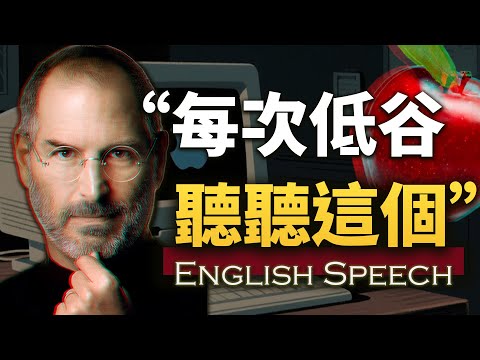
- I learned about serif and sans-serif typefaces, about varying the amount of space between different letter combinations, about what makes great typography great.
我瞭解了有襯線和無襯線字體,瞭解了不同字母組合之間的空隙變化,瞭解了優秀的字體設計之所以優秀的原因。
史上最偉大的演講之一|史蒂夫-喬布斯 (One of the Greatest Speeches Ever | Steve Jobs)
10:31
- I learned about serif and sans serif typefaces, about varying the amount of space between different letter combinations, about what makes great typography great.
我瞭解了有襯線和無襯線字體,瞭解了不同字母組合之間的空隙變化,瞭解了偉大的字體設計之所以偉大的原因。
賈伯斯史丹福演講2005 (Steve Jobs Stanford Commencement Speech 2005)
14:26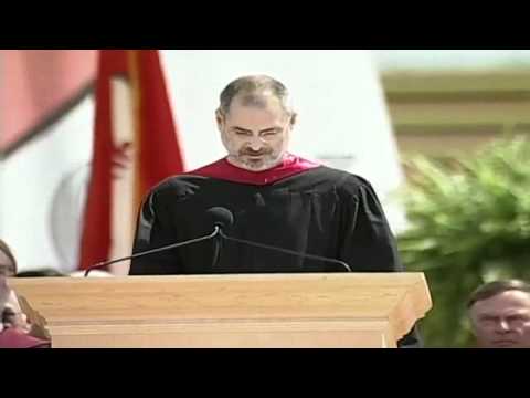
- I learned about serif and sans serif typefaces,
我瞭解了襯線字體和無襯線字體。
賈伯斯被蘋果開除:身陷低潮,我這樣逆轉命運|從大學沒唸完到科技巨擘的三個關鍵|史丹佛演講 × 原聲英聽 × 中英對照 (賈伯斯被Apple開除:身陷低潮,我這樣逆轉命運|從大學沒唸完到科技巨擘的三個關鍵|史丹佛演講 × 原聲英聽 × 中英對照)
14:11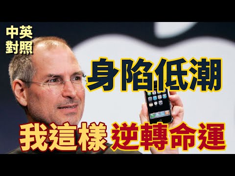
- I learned about serif and sans serif typefaces, about varying the amount of space between different letter combinations, about what makes great typography great.
我學到了字襯和無襯線字體,學到了如何調整不同字母組合之間的間距,學到了什麼讓偉大的字體設計如此偉大。